Project Name: 360 Magazine Issues
Project Type: Publication
Year: May 2022 - June 2023
Programs Used: Photoshop, Illustrator & InDesign
Project Description
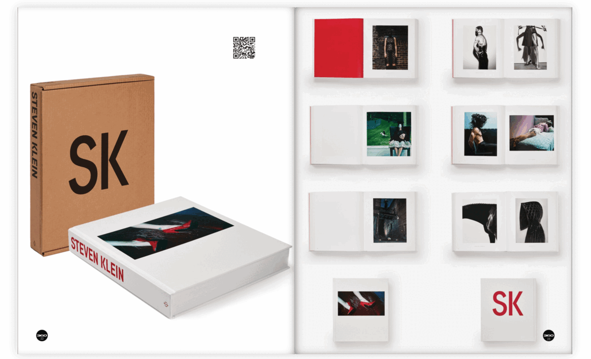
The Young Dylan book was my very first major project as an intern for 360 Magazine. They entrusted me with making their, at the time, new magazine for them to be able to sell it. After this issue, it became popular amongst their readers and with the 360 Magazine staff. Throughout the rest of my internship with them these issues would become my main projects and I did a total of 7 issues for them. With these issues, I was tasked with not only the general layout of the issue, but I also designed each of their covers, the Table of Contents (TOC), the opening and closing pages that incorporated QR codes to their online story, and in a few instances edit the images.
All 7 issues can be previewed here.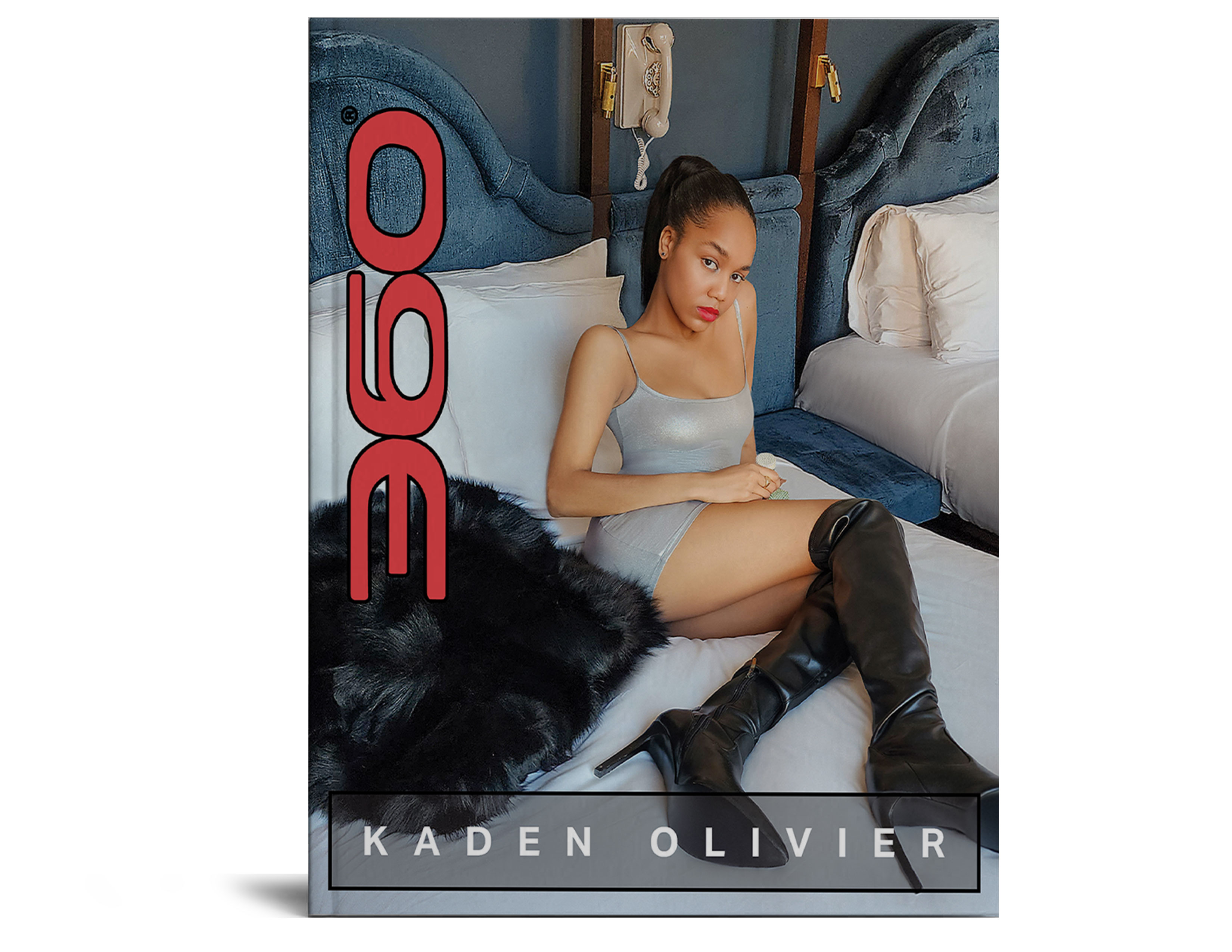
Kaden Olivier Issue
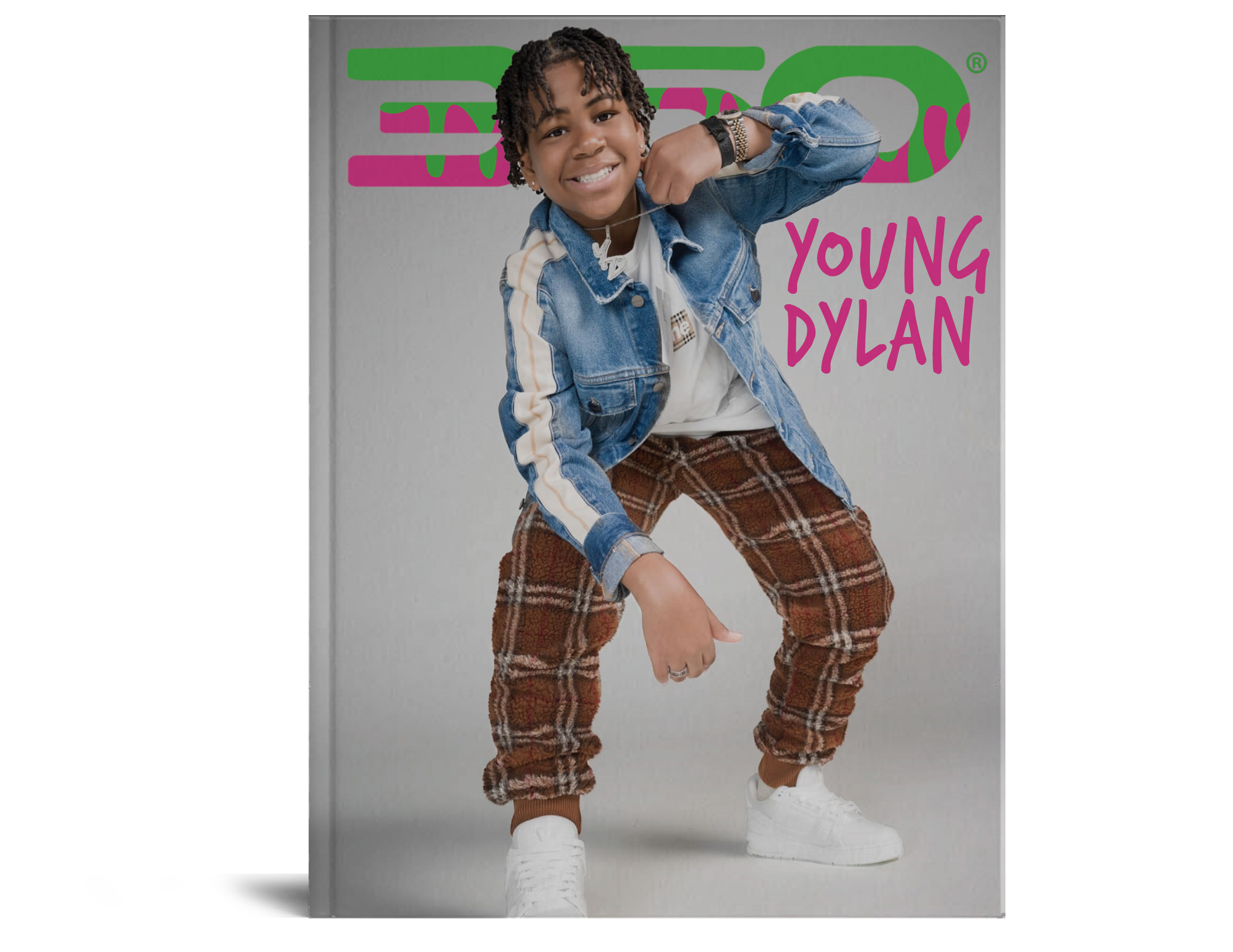
Young Dylan Issue
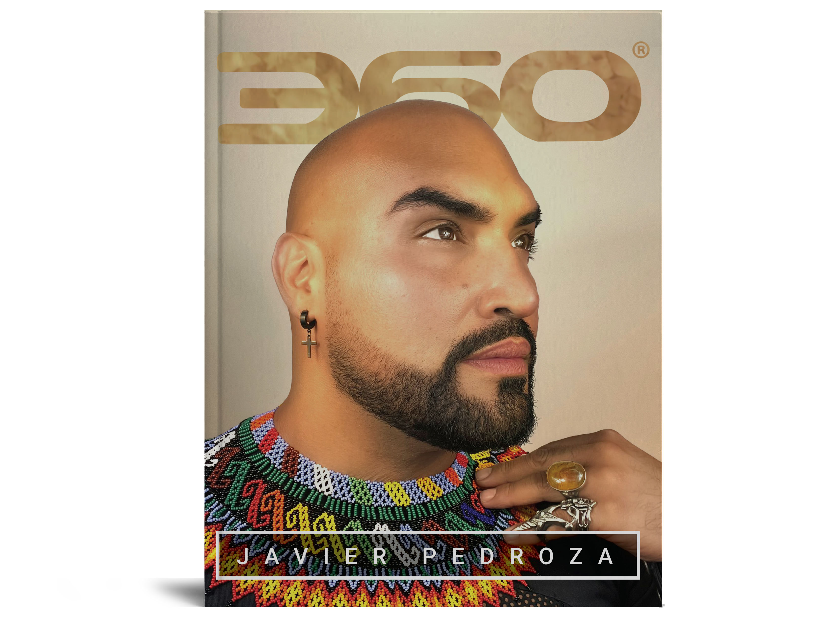
Javier Pedroza Issue
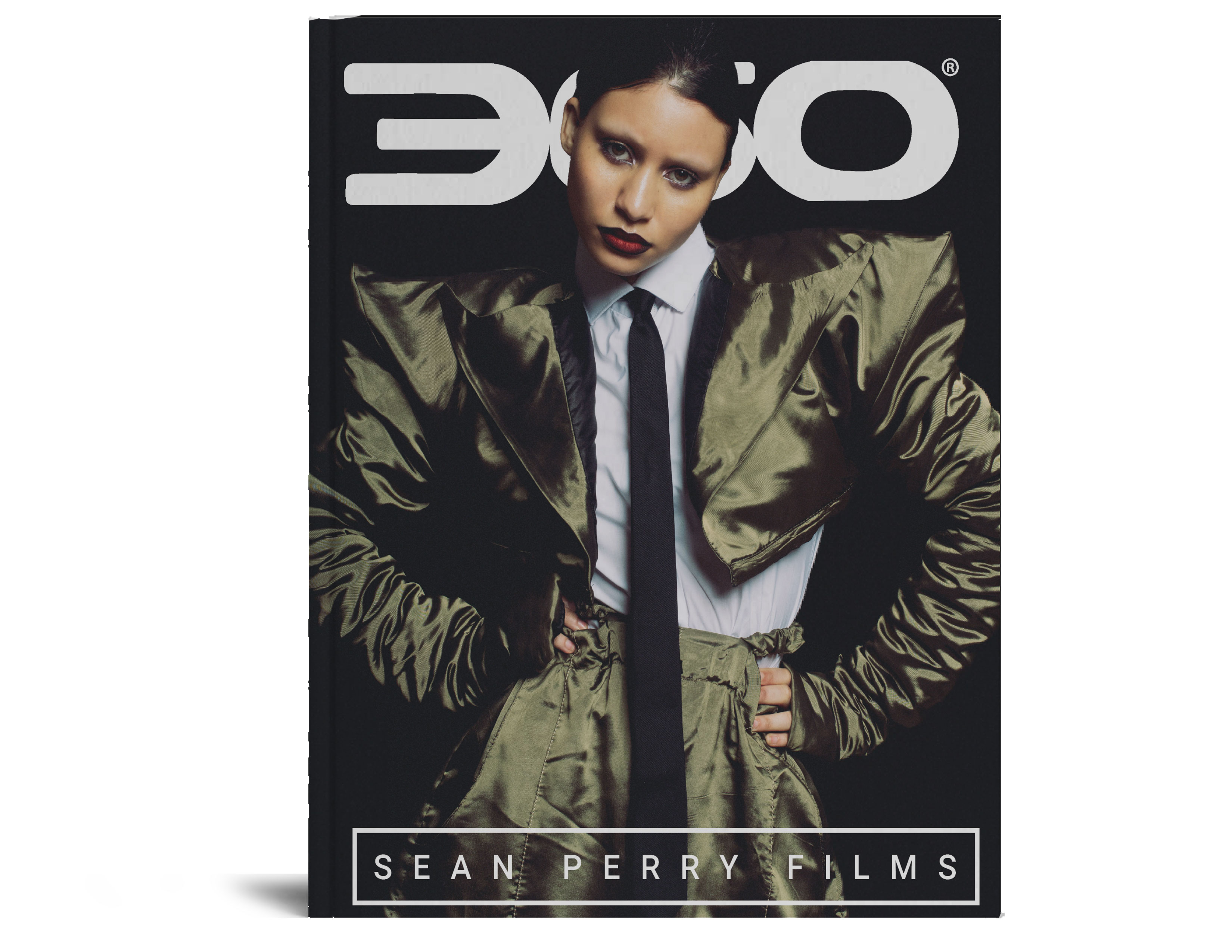
Sean Perry Issue
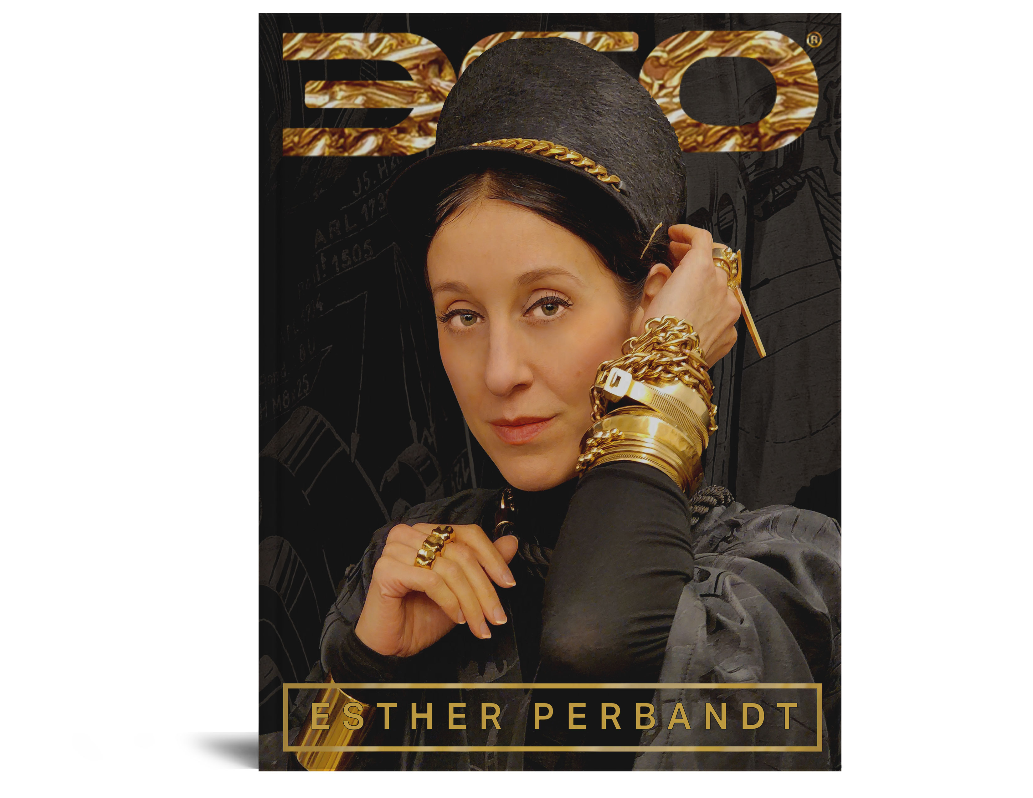
Esther Perbandt Issue
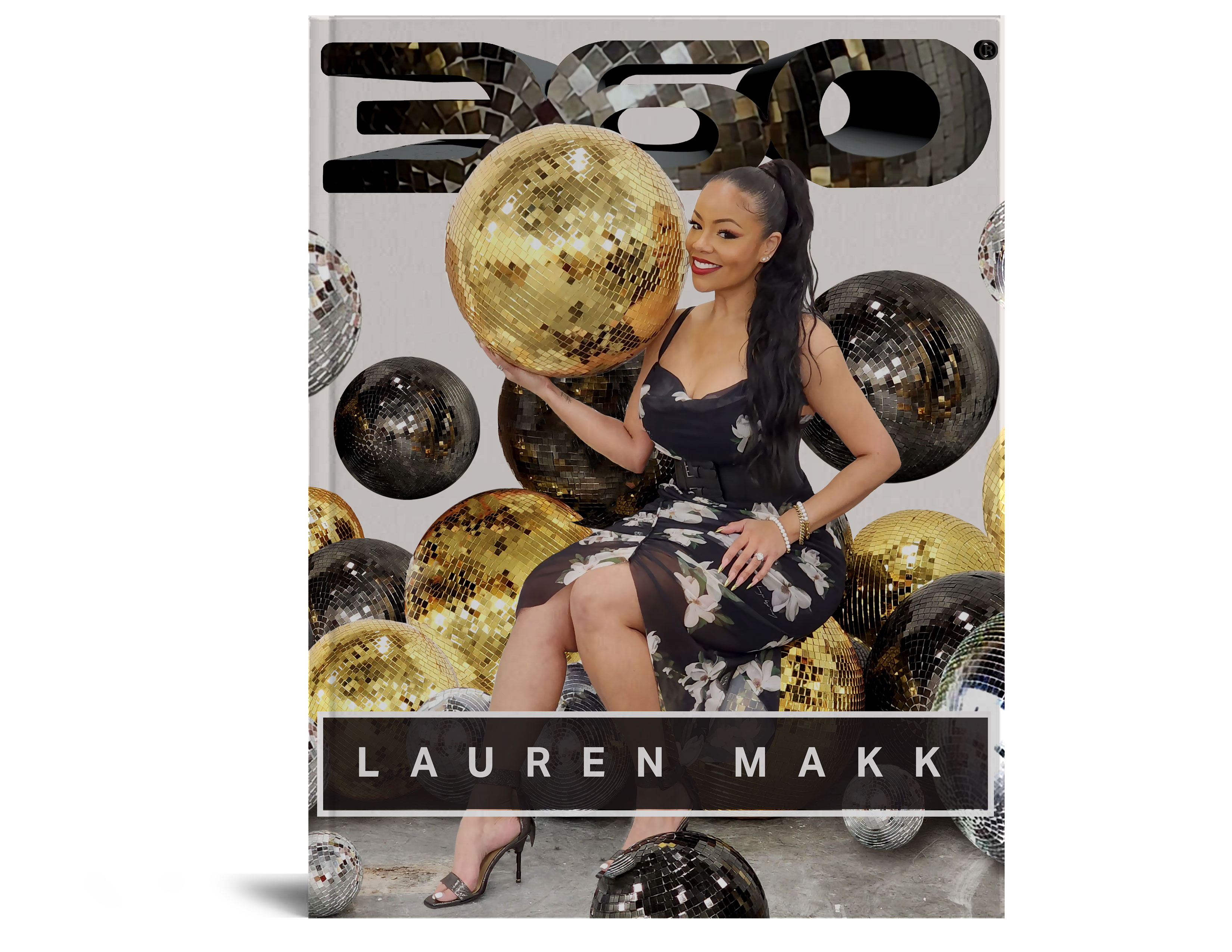
Lauren Makk Issue
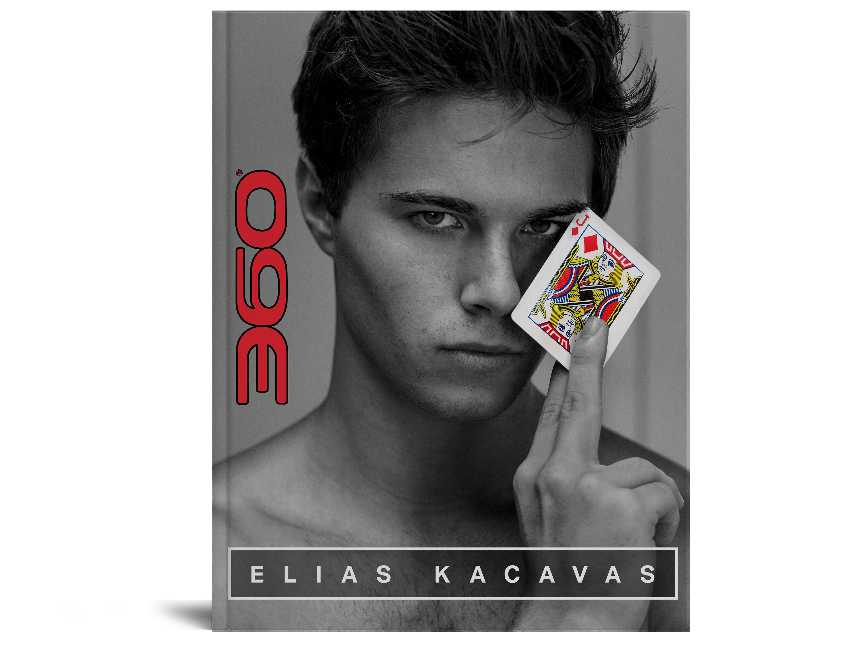
Elias Kacavas Issue
Basic Formatting
Opening/Closing Spreads
At the time I was an intern for 360 they were int he start of their new brand look shift. There new look for these issues was that there would be no text outside of the TOC. The books would instead be a main image for a particular article and then in the top corner there would be a QR code that the reader would scan that would redirect them to the website so they'd be able ot read the story there. As a different feel for the opening/closing spreads for each book they asked me to use the QR codes as a functional design element. I went ahead and used different varient ways of incorporating their circle logo to make these spreads a bit more interesting to look at. I used the circle logo ad a form of falling balloons, merging gradients, cut out frames, and bouncy balls.
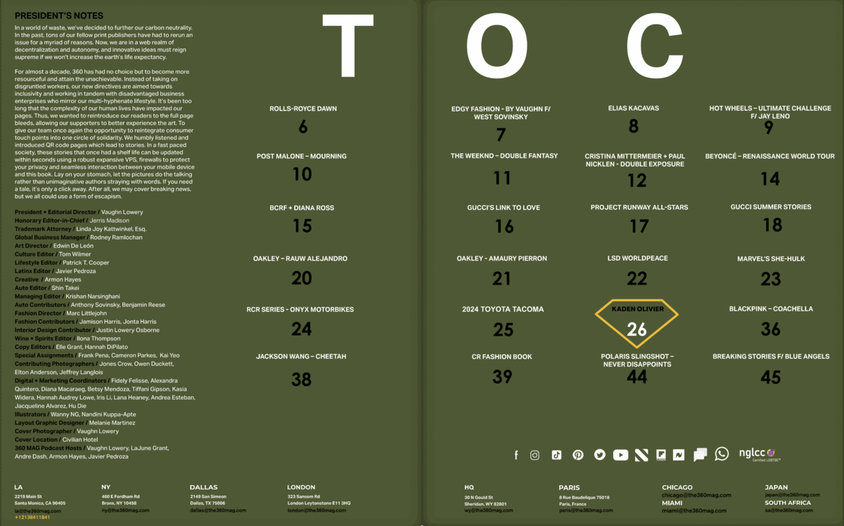
Table of Contents
For the way I layed out the Tables of Contents it's a simple grid, but it was a grid that I was still able to shift things around to fit the issues with the larger amount of content. The color palette is taken from that year's logo. The blue, red, and white was their logo colors when I first became their intern and the green, black, and white was their latest logo colors when they shifted to be more green/eco-friendly. (My name is also credited in each of the issues I did too! It's in the lower left colum where all the names of the people involved are listed.)