Project Name: Eco-Friendly Re-Branding: Pine-Sol
Project Type: Packaging Design
Year: FALL 2021
Programs Used: Photoshop, Illustrator, & Dimensions
Project Description
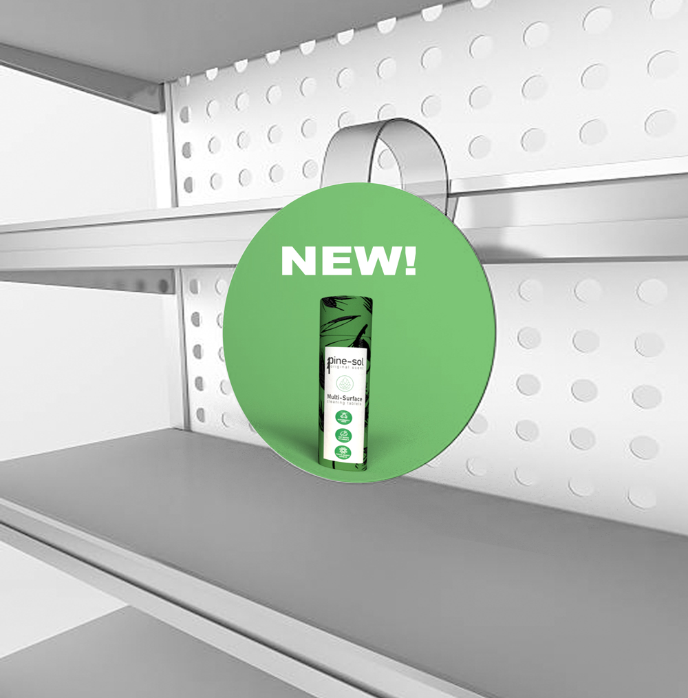
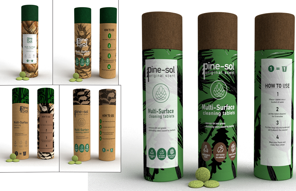
Household cleaning products are one of the major products being sold everywhere. Living in the time of the pandemic, sales for cleansing and disinfecting products go up tenfold. Cleaning products, especially liquid cleaners, are known for using a lot of plastic. Pine-Sol sells liquid cleaning solutions in gallons or in liters. Cleaning products are a one-time use product. Even though it's a liquid, there is still residue of the chemicals within said bottle thus making the gallon not recyclable. The solution for liquid cleansers inside a huge gallon of plastic is a small cleansing tablet contained inside a cardboard tube. In my choice of re-branding Pine-Sol I have created my own take on a cardboard tube designed with some eye-catching colors, illustrations, and incorporating icons.
Concept Generation
In this Concept Genration, we were asked to pick a brand that is very well-known that uses a lot of plastic within their packaging. I chose Pine-Sol solely because I hate the packaging of the gallon version. I work at a warehouse and we sell/deliver cleaning supplies. I was carrying the gallon of Pine-Sol by the plastic hanger above the cap. Little did I know that it'll snap off from the liquid being to heavy for the small plastic holder to handle it and it spilt EVERYWHERE. I just hated how so much plastic goes into this thing, but it can easily break and easily be wasted. What inspired me to do the cardboard tube packaging is the packaging for wax sticks from the brand "Wakse". It's easy to store in my bathroom, easy for stores to have a large number of this product to sell on their shelves, and it also is recycleable. In my board are some sketches from my book about how I can use the cardboard tubing packaging as a better solution to the gallon by trying to find ways to relate towards the old advertising of Pine-Sol associating the product towards literal Pine Trees.
Search, Curate, and Develop Visual Assets
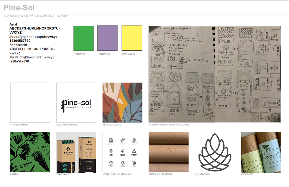
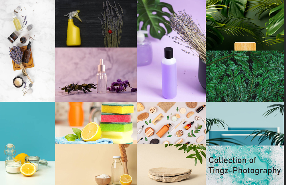
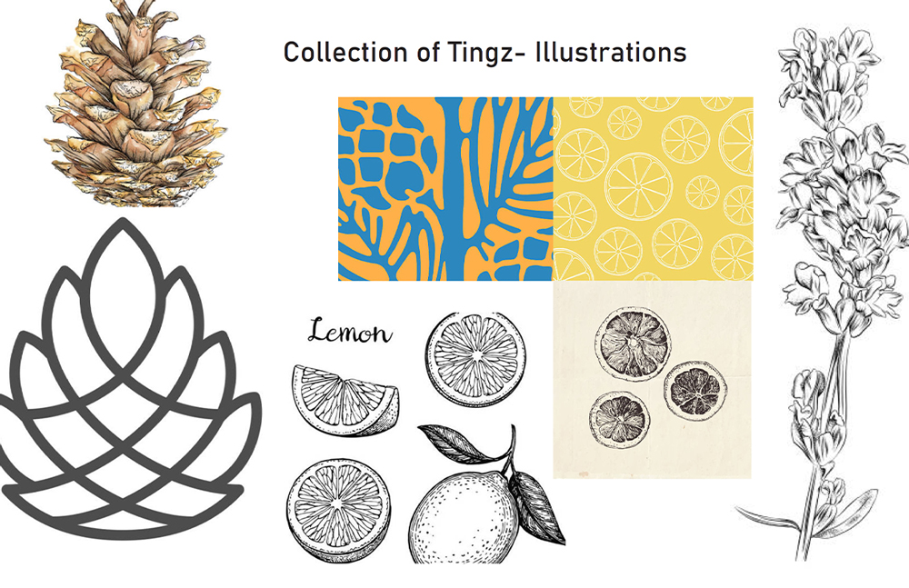
We had to go onto "istock" to get refrences on what photos we will use for advertisements, what color pallets are you going to incorporate within your designs, what kinds of icons are we thinking about using to describe the contents of our products, and if we were incorporating illustrations how are we going to use said illustrations. I based my research of finding my collection of things by the scents that are already availabke at the Pine-Sol website. I got my photos, illustrations, and colors fromm the three main scents that I both remember and have found on the site: Original, Lavender, and Lemon.
Concept Development: 1st Round
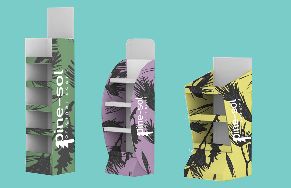
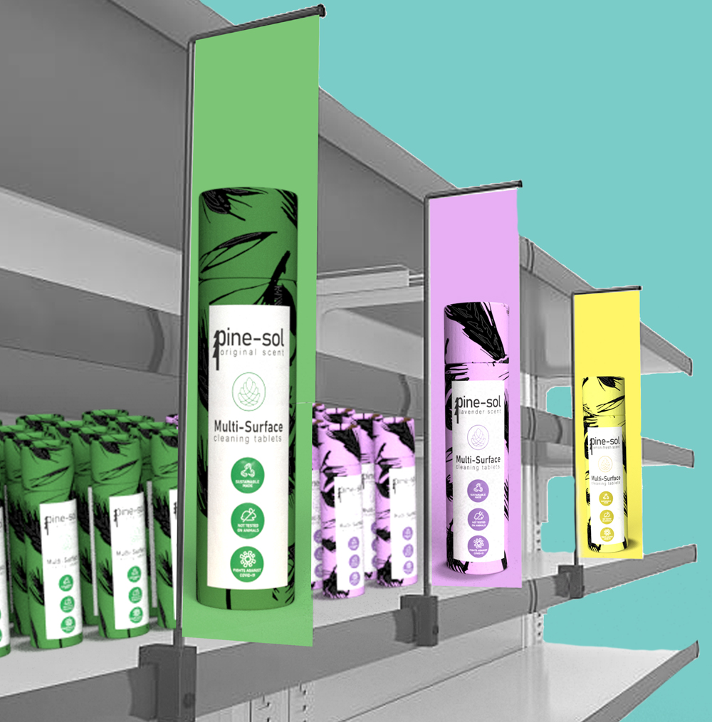
Upon doing research of how other companies have used cardboard packaging for their cleaning products I have found a couple of different ways that they changed the product itself. I originally was only thinking about the powdered solution (like Baking Soda). The powder would be within the container along with a little scoop or to have a pull out metal funnel to make it easier for the person to pour the powder into a bucket of warm water. The new way that I found out about, and ended up using it, having a powdered cleanser was to make then into dissolvable powdered tablets. The tablets made more sense for my general idea because it made it more user friendly and it would reduce the chance of making a big mess. I utilized the icons, illustrations, and overall look of the packaging from my "Collection of Tingz" research for the instructions of how to use these tablets, icons to describe the capabilities and how it's being made, and a simplified vector of the tablet underneath the product name. My first round of designs was very limited in color and illustrations. Only using the base of the tube as the pinecone and having the cap be the only indicator of the scent, or vice-versa, made it not that appealing compared to other Eco-Friendly products. It blended in with the competition too much so I went with my last concept.
Concept Development: 2nd Round
I went with the same illustrated background for both the cap and the base of the tube. Having it be a light, pastel-like color makes the product stand out more and it steers away from the stereotypical ways of Eco-Friendly design. The illustration being the same made the line of products mroe cohesive and appealing to the people's eyes. Just like ho I made the original scent green, purple is for the lavender scent and the yellow is for the lemon scent. For the instructions I included a visual to go along with each step. It fills out the large amount fo white space from the top of that label to the bottom while tieing it back to the illustrated icons at the front of the tube. This allowed me to simplify the instructions and gave me more space to spread each step out. Everything was able to fit centered along both sides of the tube.