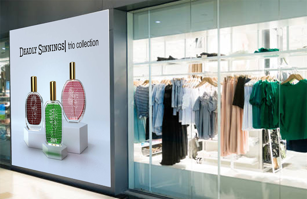
Project Name: 7 Deadly Sins Parfume: The Concept
Project Type: Packaging Design
Year: FALL 2021
Programs Used: Photoshop, Illustrator, & Dimensions
Project Description
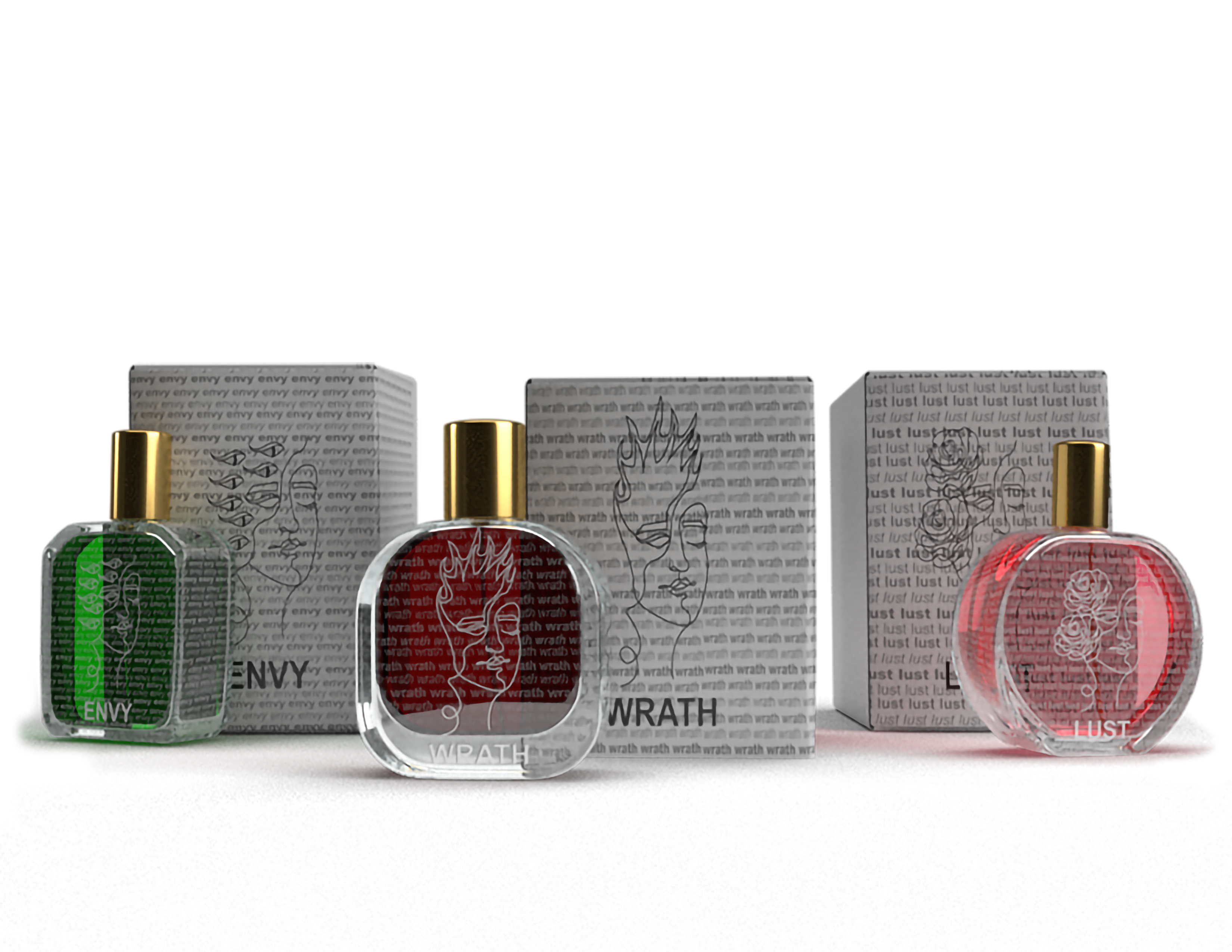
If you could smell what Wrath would be like, what would it be.....fire? I took some of the sins and turned them into their own perfume line. Inspired by the movie, "Helvetica" (2007), take the most famous and hated font and make it interesting. Take a non-physical thing (Adobe programs, emotion, Helvetica font family, etc.) and take it to physical form. My perfume concept came from a quote straight form the film, "And I think I'm right calling Helvetica the perfume of the city. It is just something we don't notice usually but we would miss very much if it wouldn't be there." At the time I was watching an anime on Netflix called "The Seven Deadly Sins" so I chose the character's sins as my non-physical concept.
Concept Generation
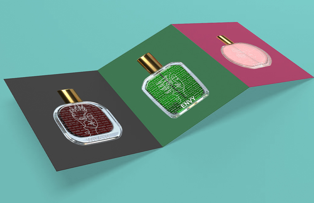
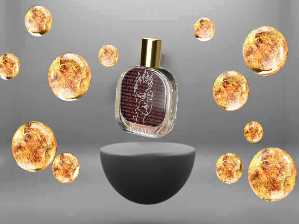
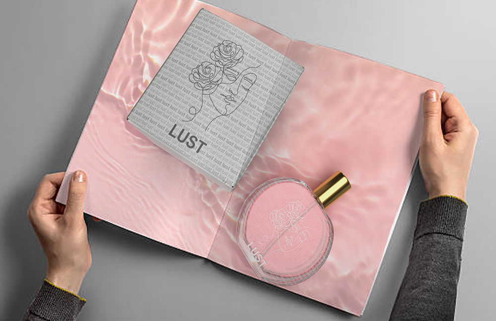
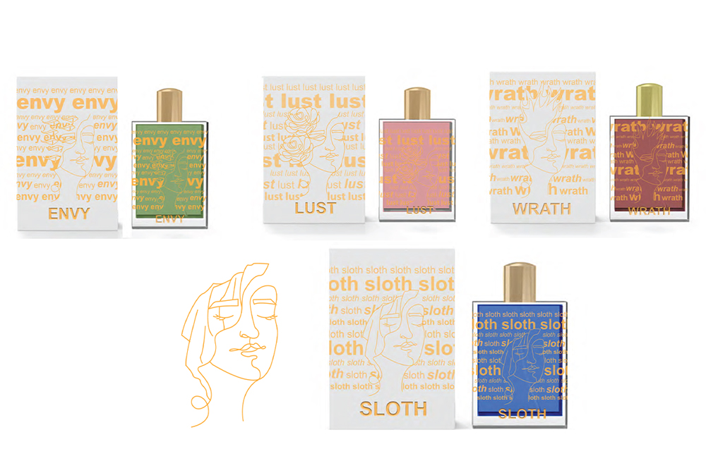
The main sins being turned into perfume are: Wrath, Lust, Envy. (I wanted to continue with doing the rest of the sins, but this project was only a 2 week long one so I didn't have time to do so.) With my perfume bottles, I wanted them to have some fancy engraving. I took inspiration towards the sellers on Etsy that they hand engrave the personalization on the glass bottle. The engravement is supposed to be the name of the sin repeating in the background in the different styles and weights of Helvetica and the face/figure of the sin itself. At the time I thought having a gold engravement would make the design look unique, but instead it blended in too much with my illustration of the sin too much.
Concept Development
I found some better looking bottles to put my designs on from Adobe Stocks. It gave me different heights and width, but similar characteristics for the bottles to look the part of being in the same colleciton. The engravings of everything went to just black and white on the boxes and white on the glass bottles. Changing the sizes of the repeating background allowed the illustration to stand out more and still be able to read the background.