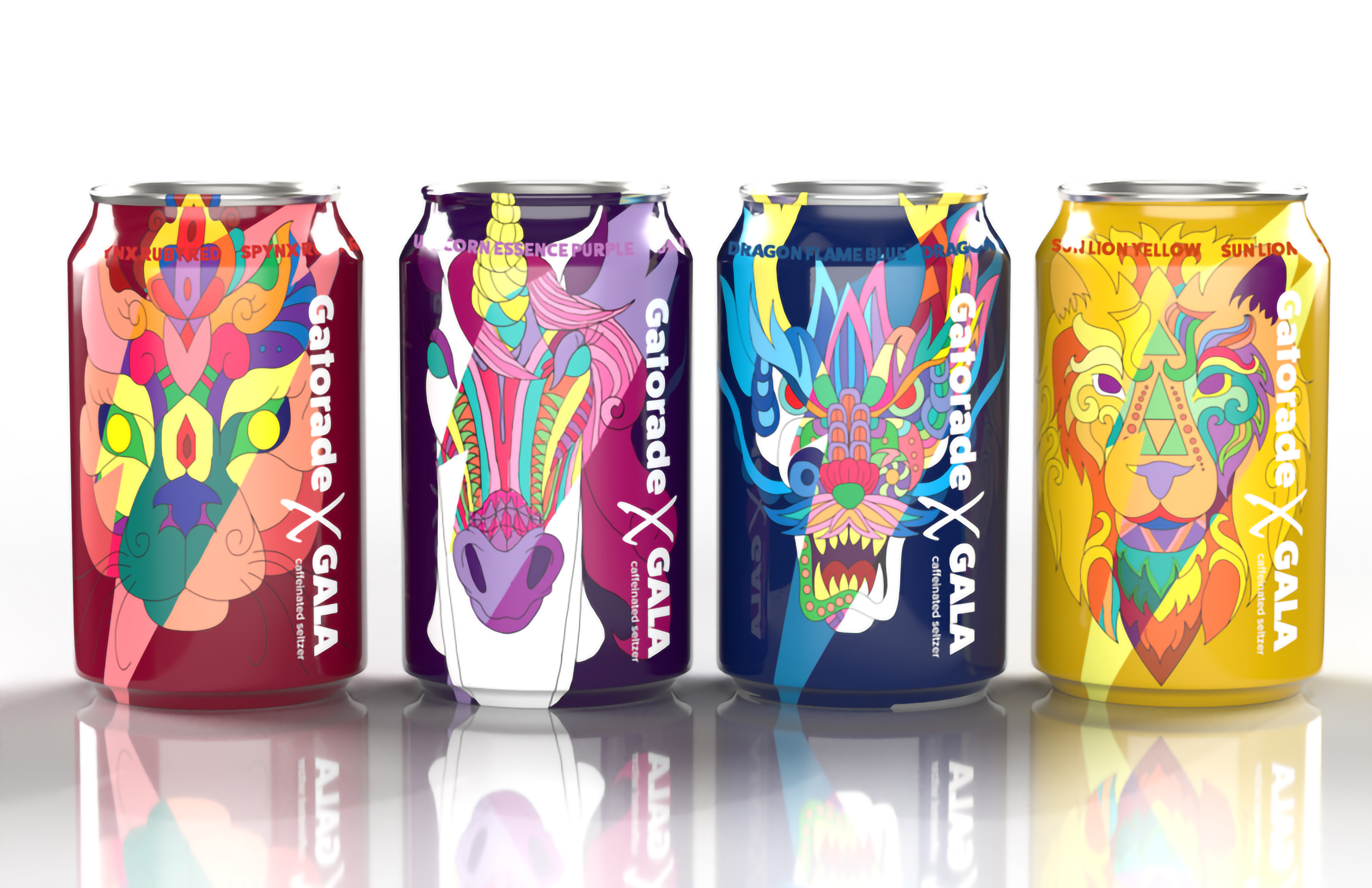
Project Name: Gatorade X Gala
Project Type: Packaging Design
Year: FALL 2021
Programs Used: Photoshop, Illustrator, & Adobe Dimensions
Project Description
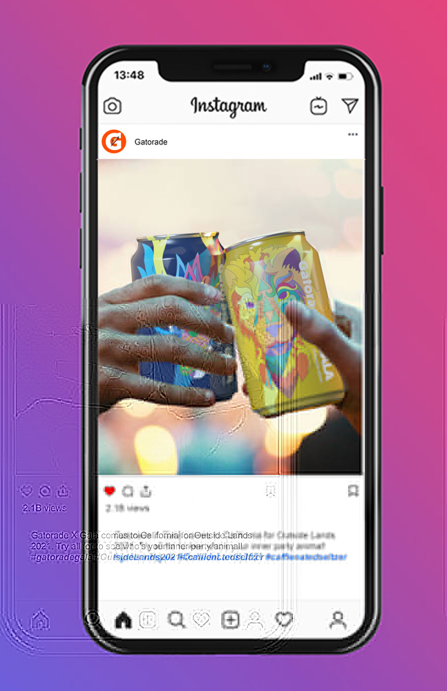
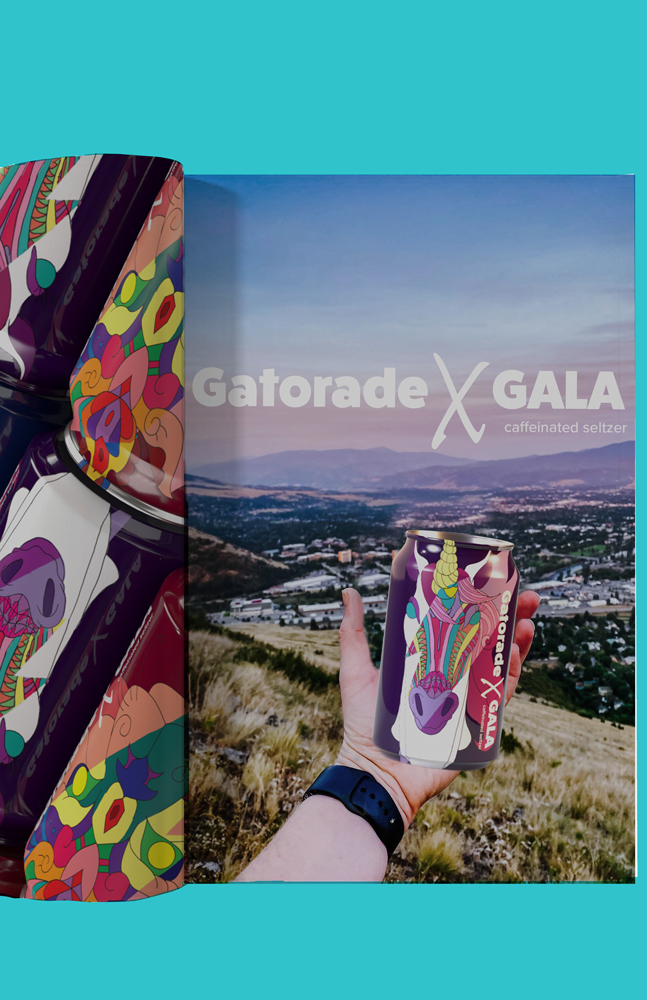
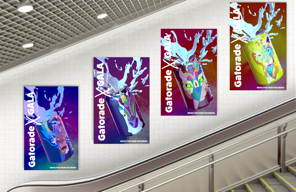
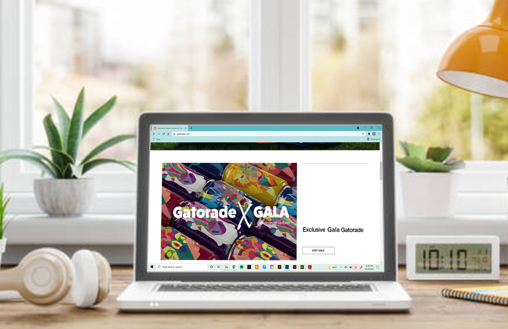
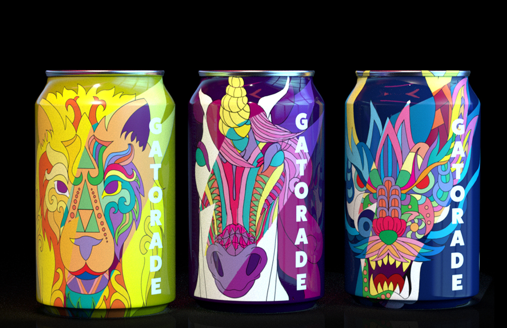
Gatorade Gala is a drink that I made up in collaboration for a Music Festival (like Coachella). It's a drink that is limited edition, meaning that only for a certain amount of time can people buy this at said festival or on the Gatorade website. It mainly comes in a set of three: Unicorn Essence Purple, Dragon Rage Blue, and Sun Lion Yellow. The Sphynx Ruby Red drink is a special new addition to this collection for the Rager four pack drink collection. This drink still has the benefits of a regular Gatorade drink, but it contains caffeine so that everyone can party like a party animal till the sun rises.
Consumer Profile
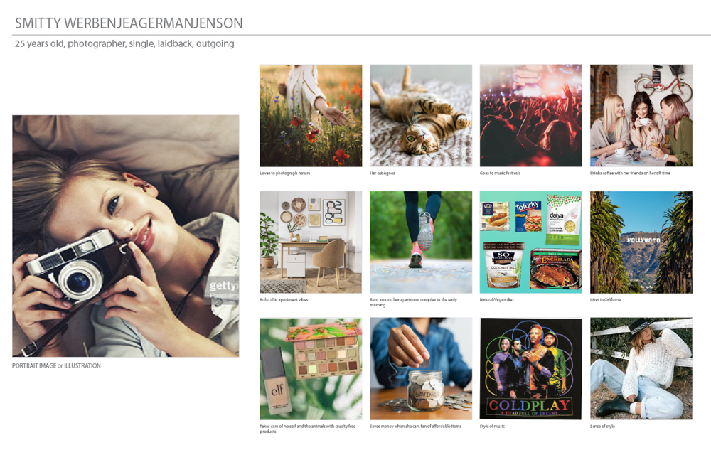
The start of this project was that we were blindly picking a piece of paper that had a stock photo of a person. This person will be our targeted audience that we made this new line of Gatorade drinks for. My professor had us blindly choose among these pieces of paper because he said something along the lines of "We are used to designing for our own personal taste. With this we will be forced to learn how to design for someone of a potential different taste than out own."
Concept Generation
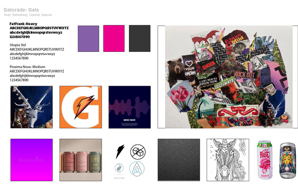
This was an activity in class where we took old magazines and made a collage out of what we liked. Within the magazines we had to think about what colors to use, fonts, icons, and illustrations that we would incorporate in our projects.
Concept Development
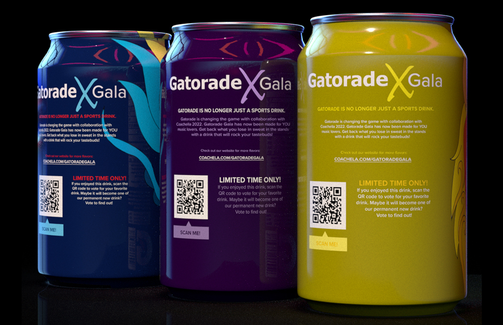
What I took from my Concept Genrartion was that I had went with the "Mandela" style for my illustration because it allows me to use bright, neon colors against a darker background, and the use of animal heads as mascots/drink identity to make the drink names more interesting and fun while being able to distinguish them from each other at the same time (like the design example "Mountain Dew: Rise" drink). The things I added that wasn't in my Concept Generation was that I added a message promoting the other drinks on the back along with a scan to "vote for the favorite drink" adn the website for this collection. In the end it was too much happening in the back and it didn't sit right for me.
Concept Refinement
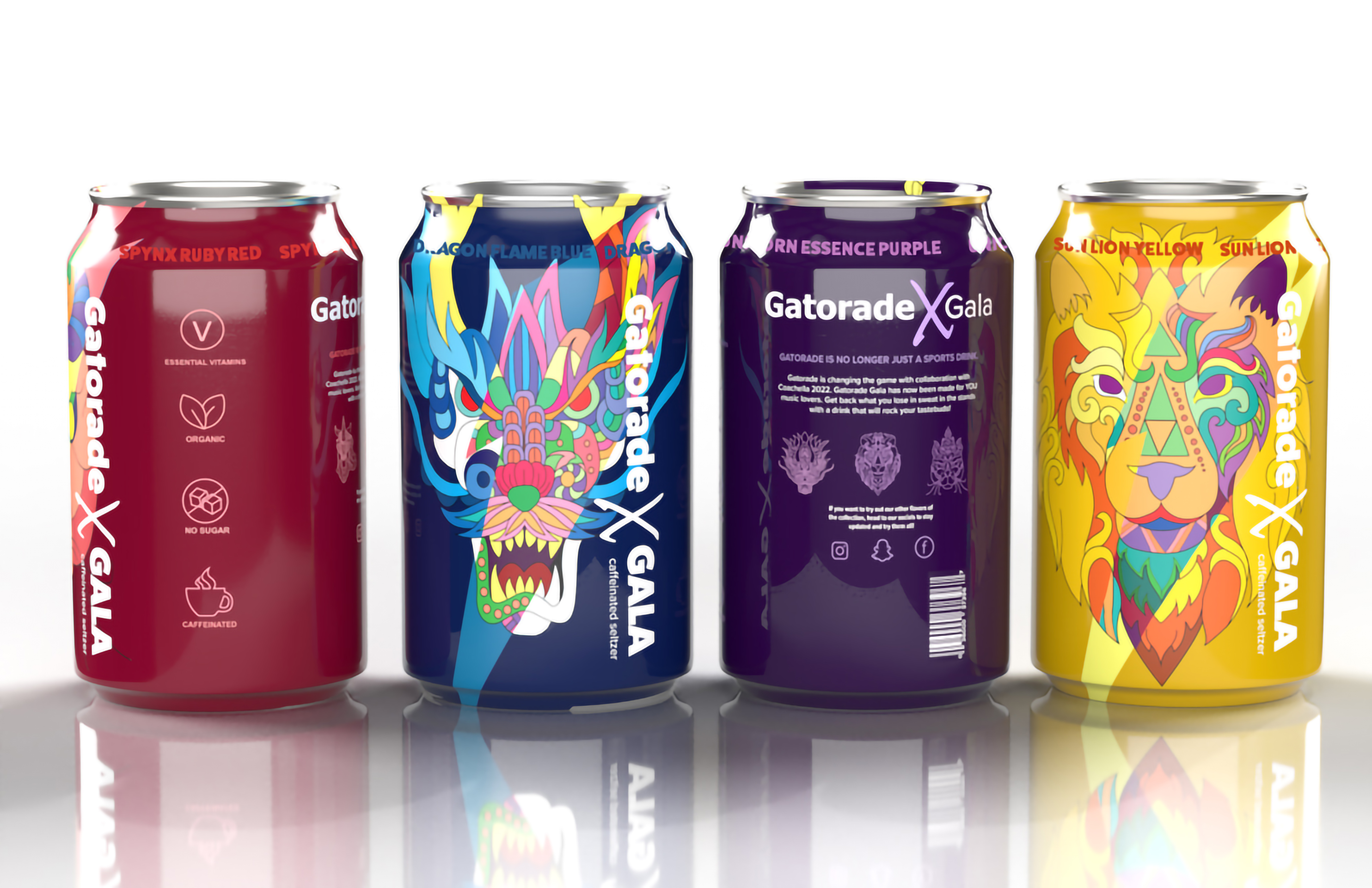
For my refinement I got rid of the ugly nutrition label and replaced it with icons with the name to show more easily what is in this drink. It also made it more easier for me to design the back of the can. I shortened the illustration at the fron of the can so that the "Gatorade X Gala" would fit more better within that space. I also added what kind of drink it was, since i accidentally forgot to do that the first time. (Oops) I shortened the message at the back so I was able to promote the other drinks differently. I made the mascot heads into small icons of the other drinks within the collection. Got rid of the website and replaced it with the social media icons since people are more likely to go to their social media rather than a website.
